Rachel Spiers, Senior Epidemiological Scientist and Lynsey Patterson, Head of Health Protection Surveillance.
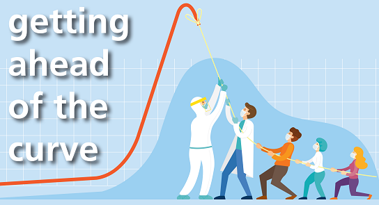
If we had to pick one phrase that captured the goal of the Public Health response to COVID-19, in the early stages, it was “flattening the curve”. From early March, this was the public plea which was shared widely in the news, on social media channels and advertising.
We understood that by slowing the spread of the epidemic (the number of new cases), we would reduce the peak number of people requiring treatment or care at any one time therefore reducing pressures on hospitals. But what exactly is the curve we are referring to? And why is it so important?
The “curve” refers to an epidemic curve (shortened to epi curve); a graphical representation of the number of cases that occur over time. We’ve discussed in previous blogs the importance of a case definition (so we know what we’re counting) but it is also important to define how we are measuring time. Often the choice of time comes down to the availability of data.
One option is the date of symptom onset but this often relies on an individual remembering when they first became unwell and therefore it can be subject to error. A second option, which is most widely used, is the date the specimen was taken. This is less prone to bias as good records are kept about samples. It is important to understand how all elements of the epi curve are defined if we are to make comparisons with elsewhere.
While the epi curve is simple by nature, it is a very important tool used by epidemiologists and clinicians to help understand outbreaks and how to respond to them, as described below.
Examples of Epidemic Curves
The most commonly observed epi curves are those arising from a contaminant that comes from a point source, a continuous source or a propagated source.
 Point Source Outbreak
When cases increase and decrease within a specific point in time. It has a classic bell shape and is what we often see after an exposure to contaminated food (for example that questionable undercooked burger from a neighbour’s BBQ!). Removing the food source will control the spread of the outbreak.
 Continuous Source Outbreak
When the source of an outbreak is more common, this curve has a characteristic plateau. A classic example is a contaminated water source, as described by John Snow in a cholera outbreak in our previous blog.
Propagated Source Outbreak
 This is observed by the spread of a pathogen from one susceptible person to another. These tend to be much more difficult to control as they are influenced by human interactions. Control measures include preventing infection (through hand hygiene or physical distancing) or through vaccination. Examples of such epidemics include Ebola, Measles and the current COVID-19 pandemic.
Turning back to COVID-19, the epi curve in Northern Ireland is shown in Figure 1 of the PHA monthly bulletin.

Figure 1. Laboratory confirmed COVID-19 cases by sample date and source (HSC Laboratory testing and the National Testing Programme), 2020
From the epi curve we see that the first case occurred on 26 February, with some transmission leading to low numbers of cases throughout early March. These were mostly travel associated and so the focus of the Public Health response at the time was about early identification of COVID-19 in individuals with recent travel, to try and prevent the emergence of community spread.
By the end of March we saw a sharp increase in the number of cases (almost double per day), indicating higher transmission within the community. At this point, there was regional lockdown (to try and limit human interactions and therefore reduce spread) and we began testing individuals who presented to hospital regardless of their travel history.
The curve peaked on 17 April, reaching 173 cases, the highest number seen per day during the pandemic in Northern Ireland. From May onwards, the number of cases slowly began to decrease, indicating reduced transmission within the community and the success of control measures.
Throughout the month of June, numbers of COVID-19 cases per day remained relatively stable. This can also be observed by a “levelling off” of the cumulative count of cases (observed by the dotted line). Throughout July we continue to see smaller daily peaks relating to localised clusters as lockdown measures have been eased.
Hopefully you now understand why the simple epidemic curve has such an important function in Public Health. As lockdown measures ease, we will be keeping a close eye on the epi curve to evaluate the effectiveness of control measures and help guide our response to COVID-19 in the coming months. We will also continue with the “Test, Trace and Protect” contact tracing service to identify chains of transmission early and bring them under control. This virus has the potential to make its presence felt in any district. Everyone should act on the basis that it might potentially be in their neighbourhood right now. That’s why following the public health advice on regular hand washing and maintaining a social distance of two metres remains vitally important.
If anyone is concerned that they are experiencing any of the symptoms of coronavirus, they must self-isolate and arrange a test as soon as possible. For further information on the virus, its symptoms and how to book a test, visit www.pha.site/coronavirus
We must be aware that COVID-19 is still a threat and we need everyone to play their part in helping to stop the virus spreading.